Every product speaks — buttons, toasts, empty states. The only question is whether anyone chose that voice, or whether it's just whatever shipped last. Here's how Solflare built its product voice from three pillars into a thousand consistent decisions.
The Voice You Didn’t Choose
Whose voice does your digital product speak in? To find out, open it up and read three strings out loud: a button, a toast, and an empty state. There’s your answer.
Every product speaks. Buttons speak. Toasts speak. Empty states speak. The only real question is whether you wrote that voice, or whether it’s the average of every string that shipped last quarter: soft where it should be sharp, polite where it should be clear, generic where it should be yours.
At Solflare, we wrote ours down. This post is what we learned from doing it, and from the small, stubborn decisions it forced us to make.
Billboards and Buttons
Step one is a vocabulary problem. Brand voice and product voice are often used interchangeably, and they shouldn’t be.
What is brand voice? It is a performance. It runs on homepages, billboards, and social feeds; it’s loud, opinionated, emotional, and built to make you feel something.
Product voice, by contrast, is an interface. It runs on toasts, headings in your app, error states, empty states, and modal titles. Its job is to tell a user what just happened and what to do next. Loud doesn’t help. Opinionated doesn’t help. Clear helps.
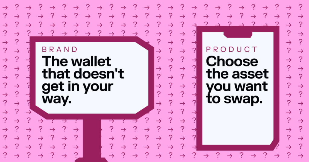
Hold the two side by side. Brand: The wallet that doesn’t get in your way. Product: Choose the asset you want to swap. One belongs on a billboard. The other belongs above a button. Swap them, and both fail: the billboard goes quiet, and the button goes vague.
The most common mistake is treating the two as one. Brand decks describe how the marketing team should sound; product surfaces inherit that by default, resulting in in-app copy that reads like a campaign.
The Default Voice Is the Worst Voice
How does the product team drift into a default voice? Without rules, that’s how. Without a framework, copy will drift toward whichever phrase felt safest at standup, and whoever ships the string sets the standard until the next person ships a different one.
LLMs make this worse, not better. Open-web training distributions default to polite, hedging, and faintly enthusiastic — full of We kindly ask you to… Please be aware that… We’re here to help! If your voice isn’t defined, the model fills the vacuum with the average voice of every SaaS dashboard on the internet.
What that looks like in practice falls into three failure modes you can actually feel.
Inconsistency: Before we wrote our product content guide, Deposit was doing too much work inside Solflare. It was labeling buying, funding, on-ramping, and receiving — four distinct actions in one word, leaving users to figure out which from context. A user tapping Deposit, hoping to wire fiat in, would land on a receive-address screen and bounce.
Another user who tapped it to receive a transfer would get pushed into an on-ramp provider mid-flow. Same label, four jobs, four mental models colliding in the same tab. Multiply that across Wallet, Account, Address, with each carrying two or three meanings depending on the screen, and the product stops feeling like one product. It feels like four teams who’ve never met.
Generic-ness: This is copy that could be lifted into any wallet, any bank, any SaaS dashboard, and nobody would notice it had moved. Welcome back! Let’s get you set up. Oops, something went wrong. You’re all set! Manage your account. Strings that pass review because nothing is wrong with them, and fail the product because nothing is of it.
The test is a swap: take the string, drop it into a competitor’s screenshot, and see if anyone can tell it moved. If the answer is no, the copy isn’t doing its job for you; it’s just filling space the product was supposed to occupy.
Quiet damage: Apologetic system messages erode trust; over-celebratory toasts feel patronizing; hedged warnings don’t actually warn: We’re sorry, but your transaction couldn’t be processed at this time. Please try again later. — a sentence that apologizes, blames nothing, and gives the user nothing to act on. Woohoo! 🎉 You sent 0.1 SOL! — confetti-grade celebration for a routine transfer has the kind of energy that reads as condescending the second time and grating by the tenth.
Both ship clean through code review. Neither belongs in a product that wants to be trusted with money.
A product without a written voice still has one. Just not one anyone chose.
From Three Adjectives to a Thousand Decisions
Three traits sit at the center of Solflare’s product voice: level–headed, battle–tested, iron–willed. Clear above all else. Authoritative and patient. Energized and opinionated. Every brand deck has adjectives like these; they don’t do any work on their own.
The work is the translation: turning the three traits into a thousand small decisions that the team can make the same way, without re-litigating any of them. Two of those decisions show what that translation actually looks like in practice.
The first is a single missing character. Look at a Solflare toast: Card canceled, Copied to clipboard, Wallet renamed. No full stop. Ever. Early product copy had them. Card canceled. Wallet renamed. The period was the default; it followed every other piece of writing on the team. It also felt heavy. A two-second floating notification read like a sentence handed down from a system that needed to wrap things up neatly. It read more like a verdict than a signal.
Walking it back to the pillars settled it. Level-headed says the toast is a signal, not a sentence. Battle-tested says the period reads as finality the user doesn’t need. Restraint reads as composure. The rule that landed was simple: no trailing full stop on a toast, ever. A mid-toast period is allowed only when it separates a failure statement from a recovery hint: Couldn’t send. Try again. Two phrases doing two jobs, not a sentence ending.
A single missing character, decided once, reused thousands of times across every success, neutral, and failure toast in the product. Multiply that by 27 localized languages, and the savings compound; translators don’t re-debate punctuation per locale either.
The second decision has a larger surface area but follows the same logic. Most wallets in this category say tokens: for swap, send, portfolio, the works. Solflare says assets. That’s a deliberate divergence. Token is the blockchain-native term, and it’s accurate, but it’s a word users don’t bring with them from anywhere else in their financial life. Nobody opens their bank app and reads about their tokens. Asset is the word they already have for everything else they own. It maps to portfolio, to wealth, to yours.
The pillar argument is two-pronged: level-headed says use the word the user already has; battle-tested says internal consistency beats matching whatever the rest of the category does. Users live inside our product, not side by side with competitors.
The decision shows up everywhere: in Swap (choose the asset you want to swap), in Send, in onboarding, and in error states (get your assets back). Tokens stays reserved for technical and educational contexts where the blockchain-level term is the right one, referencing SPL tokens, explaining token standards. One terminology call, made once, resolves a thousand future copy debates and gives every future LLM-drafted string a default to land on.
Both decisions follow the same shape: a small, specific call made at the pillar level, encoded once, and inherited by every string that follows. None of that closes the door on judgment. The guide doesn’t cover every edge case, and it isn’t trying to. A good guide is honest about its limits and leaves room for the next decision to walk in.
The Guide Is a System Prompt
Decisions like these used to live in a guide a writer would reference. Now they live in a system prompt a model reads before every draft.
LLMs are writing first drafts of product copy in most orgs now, whether anyone admits it or not. PMs prompt for empty states, engineers prompt for error messages, and designers prompt for onboarding flows. The string that ships often started as a generation, got lightly edited, and then went out the door. That isn’t a problem on its own; it’s a problem when the model has nothing to work from but its training distribution.
A model is only as good as the constraints you give it. Write a friendly error message produces three polite, hedging sentences where one would do. Write a one-line error message, no apologies, no “we,” no trailing period, name what failed, and offer one recovery action produces something usable. The difference isn’t in the model. It’s in the prompt.
A product content guide is the best prompt you’ll ever write. Feed the pillars, the component anatomy, and the do/don’t logic into the system prompt, and the output stops being generic; it starts sounding like your product. Without the guide, the LLM imports average slop. With it, you extend your voice to the scale you actually need. The more copy gets generated, the more valuable the rules that govern it become.
The Guide Is Load-Bearing
A product content guide is a piece of infrastructure, just like a design system. It’s invisible when it works, expensive when it doesn’t, and load-bearing either way.
It works because it isn’t a rulebook to enforce; it’s a set of decisions to reuse — written down so they stop bottlenecking the team, and so they get made early, in discovery, in the wireframe, in design review, not in a polish pass two days before ship. The cheapest copy fix is the one made before the screen ships; the most expensive is the one made after launch, after localization, and after the screenshots have linked to the old label.
If a user reads it, a UX writer should have weighed in: modal titles, error messages, empty states, button labels, toasts, and onboarding steps. Decide once, decide early, and the product gets designed around the words instead of retrofitting them in.
It pays back in three places.
Consistency: The product sounds like one product, not a committee.
Speed: Writers, designers, and PMs stop re-debating the same patterns and ship faster.
Scale: It’s the substrate that lets AI-generated copy stay on-brand without a human having to rewrite every string.
The takeaway isn’t: write more carefully. It’s decide once, encode it, and let the decisions do the work.
Your product has a voice, whether you wrote it down or not. The only choice is whether you own it.